


Source Article:
Introduction
Layout Algorithm
Each layout algorithm is designed to solve a specific problem. The default Flow layout is meant to create digital documents; it’s essentially the Microsoft Word layout algorithm. Headings and paragraphs stack vertically as blocks, while things like text, links, and images sit inconspicuously within these blocks.
While Flexbox is all about flexibility. We can control whether items grow or shrink, how the extra space is distributed, and more.
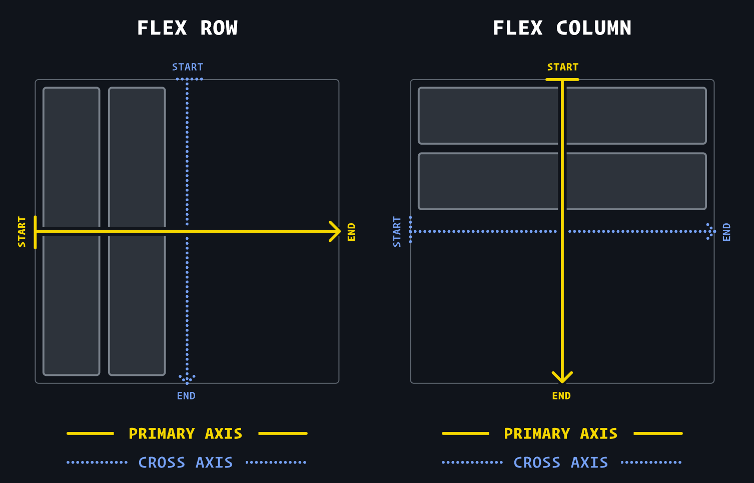
Flex direction
Flex direction determines the primary axis, and the cross axis that runs perpendicularly.
flex-direction: row: primary axis runs horizontally, from left to right.flex-direction: column: primary axis runs vertically, from top to bottom.
Alignment
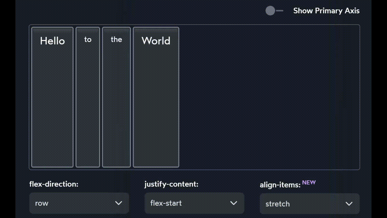
4 Key Terms to Understand Alignment
justify— to position something along the primary axis.align— to position something along the cross axis.content— a group of “stuff” that can be distributed.items— single items that can be positioned individually.
justify-content
We can change how children are distributed along the primary axis using the justify-content property:
- bunch all the items up in a particular spot (with
flex-start,center, andflex-end) - spread them apart (with
space-between,space-around, andspace-evenly).
justify-self
There’s no justify-self because you cannot adjust one single element across the primary axis.
What would it mean for that middle piece to set
justify-self: flex-start? There’s already another piece there!
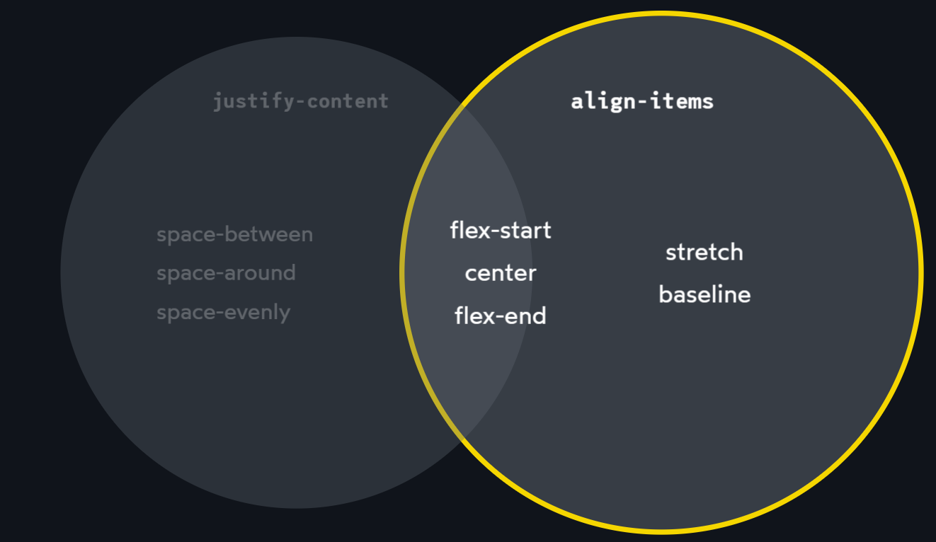
align-items
For the cross axis, We use the align-items property:
- flex-start, center, flex-end (same as justify-content)
- stretch, baseline (different with justify-content)
align-self
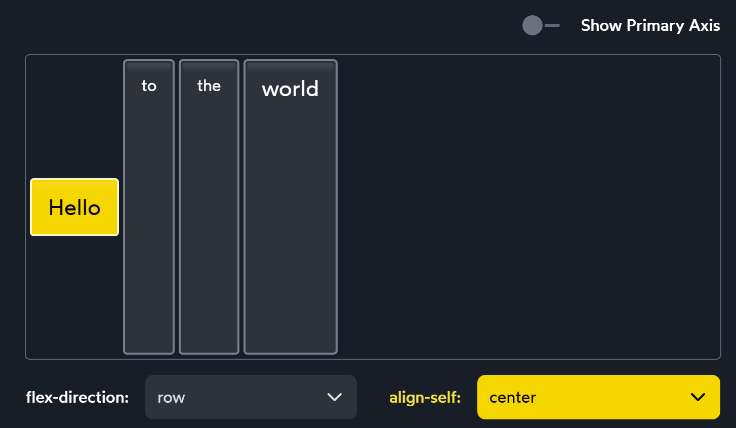
align-self has all the same values as align-items. In fact, they change the exact same thing. align-self changes a single child element. align-items is syntactic sugar, a convenient shorthand that automatically sets the alignment on all the children at once.
Hypothetical size
- In Flow layout,
widthis a hard constraint. - In Flexbox, however, the
widthproperty is more of a suggestion than a hard constraint.
CSS mental model
wrong model
Think of the CSS language as a collection of properties
As we’ve seen, the
widthproperty behaves differently depending on the layout mode used!right model
CSS as a collection of layout modes. Each layout mode is an algorithm that can implement or redefine each CSS property. We provide an algorithm with our CSS declarations (key/value pairs), and the algorithm decides how to use them.
Growing and Shrinking
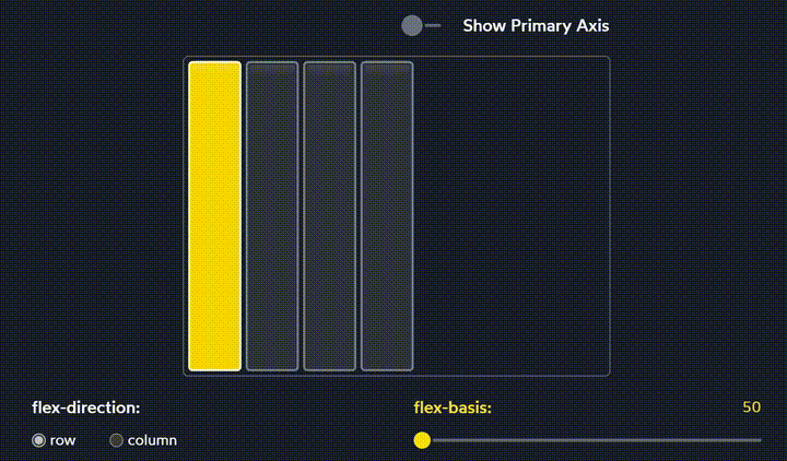
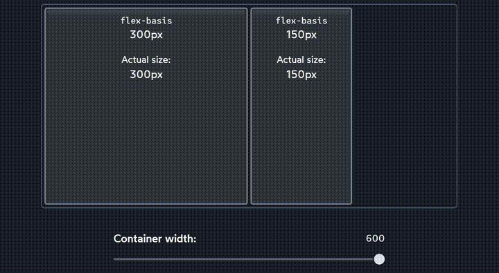
flex-basis
- In a Flex row,
flex-basisdoes almost the same thing aswidth. In a Flex column,flex-basisdoes the same thing asheight. widthwill always affect the horizontal size. It doesn’t suddenly becomeheightwhen we flipflex-directionfromrowtocolumn. Same to height.
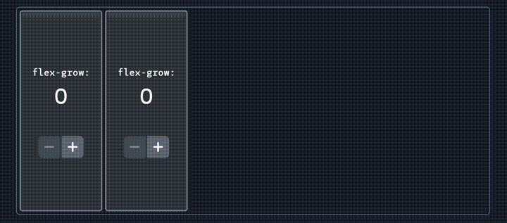
flex-grow
flex-grow tells us how to allocate free space to child elements
flex-shrink
What if our children are too big for their container?
Both items shrink, but they shrink proportionally. The first child is always 2x the width of the second child.
flex-shrink tells us how elements shrink when container is not enough big. To prevent elements from scaling down, set flex-shrink to 0.
Minimum Size
In addition to the hypothetical size, there’s another important size that the Flexbox algorithm cares about: the minimum size.
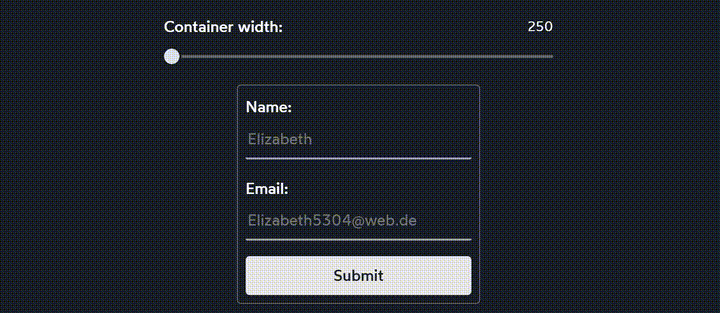
- Text inputs have a default minimum size of 170px-200px (it varies between browsers).
- For an element containing text, the minimum width is the length of the longest unbreakable string of characters.
Gap
Using justify-content: space-between cannot control space between child elements. gap allows us to create space in-between each Flex child. This is great for things like navigation headers:
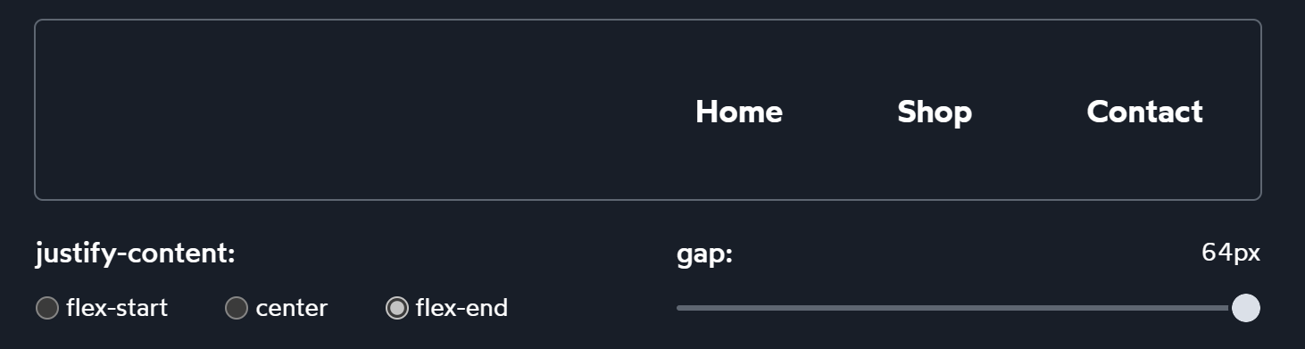
gap is a relatively new addition to the Flexbox language.
Auto margins
- Earlier, we saw how the
flex-growproperty can gobble up any extra space, applying it to a child. - Auto margins will gobble up the extra space, and apply it to the element’s margin. It gives us precise control over where to distribute the extra space.
So both do the same thing. But why auto margins?
Auto Margins
The auto-margins solution treats the extra space as a resource, and deciding exactly where it should go. This solution makes space to become margin while the flex-grow solution gives free space to the body.
Wrapping
- When we set
flex-wrap: wrap, items won’t shrink below their hypothetical size. - Each row has its own mini flex container
align-content
When elements wraps, we can use it to align the rows themselves.
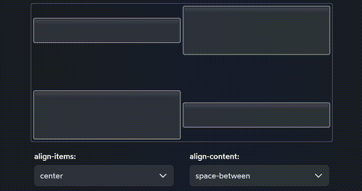
Summary
flex-wrap: wrapgives us two rows of stuff.- Within each row,
align-itemslets us slide each individual child up or down- Zooming out, however, we have these two rows within a single Flex context! The cross axis will now intersect two rows, not one. And so, we can’t move the rows individually, we need to distribute them as a group.
- Using our definitions from above, we’re dealing with content, not items. But we’re also still talking about the cross axis! And so the property we want is
align-content.